Main mxml file (say AHCkeckboxTest.mxml )
<?xml version="1.0" encoding="utf-8"?>
<s:Application
xmlns:fx="http://ns.adobe.com/mxml/2009"
xmlns:s="library://ns.adobe.com/flex/spark"
xmlns:mx="library://ns.adobe.com/flex/halo"
minWidth="1020"
minHeight="720"
frameRate="99"
backgroundColor="0xe0f0ff" viewSourceURL="srcview/index.html">
<fx:Style>
@namespace mx "library://ns.adobe.com/flex/halo";
@namespace s "library://ns.adobe.com/flex/spark";
s|CheckBox {
skinClass: ClassReference("AHCheckboxSkin");
symbolColorChecked: "0x70d000";
symbolColorUnchecked: "0xe83800";
fontSize: "11";
color: "0x606060";
}
.default {
skinClass: ClassReference("spark.skins.spark.CheckBoxSkin");
}
</fx:Style>
<s:HGroup gap="25" horizontalCenter="0" verticalCenter="0">
<s:VGroup gap="5">
<s:Label text="Default Spark CheckBox" paddingBottom="4" fontSize="11" textDecoration="underline" />
<s:CheckBox label="Show Goalkeepers" styleName="default" selected="true" />
<s:CheckBox label="Show Defenders" styleName="default" />
<s:CheckBox label="Show Midfielders" styleName="default" selected="true"/>
<s:CheckBox label="Show Attackers" styleName="default" selected="true"/>
<s:CheckBox label="Show Coaches" styleName="default" />
</s:VGroup>
<s:Line height="100%" >
<s:stroke>
<s:SolidColorStroke weight="1" color="0xd0e0f0" />
</s:stroke>
</s:Line>
<s:VGroup gap="5">
<s:Label text="Custom Spark CheckBox" paddingBottom="4" fontSize="11" textDecoration="underline" />
<s:CheckBox label="Show Goalkeepers" selected="true" />
<s:CheckBox label="Show Defenders" selected="true"/>
<s:CheckBox label="Show Midfielder" />
<s:CheckBox label="Show Attackers" />
<s:CheckBox label="Show Coaches" selected="true"/>
</s:VGroup>
</s:HGroup>
</s:Application>
Skin class (say AHCheckboxSkin.mxml )
<?xml version="1.0" encoding="utf-8"?>
<s:SparkSkin xmlns:fx="http://ns.adobe.com/mxml/2009" xmlns:s="library://ns.adobe.com/flex/spark"
alpha.disabledStates="0.5" creationComplete="sparkskin1_creationCompleteHandler(event)">
<fx:Metadata>
<![CDATA[
/**
* @copy spark.skins.default.ApplicationSkin#hostComponent
*/
[HostComponent("spark.components.CheckBox")]
]]>
</fx:Metadata>
<fx:Script>
<![CDATA[
import mx.utils.ColorUtil;
import mx.events.FlexEvent;
[Bindable]
private var highlightColor:uint;
protected function sparkskin1_creationCompleteHandler(event:FlexEvent):void
{
hostComponent.buttonMode = true;
hostComponent.useHandCursor = true;
var col:uint = uint (hostComponent.getStyle('color'));
highlightColor = ColorUtil.adjustBrightness(col, 80);
}
]]>
</fx:Script>
<fx:Declarations>
<s:Linear id="easer" easeInFraction="0.5" easeOutFraction="0.5" />
</fx:Declarations>
<s:states>
<s:State name="up" stateGroups="unchecked" />
<s:State name="over" stateGroups="overStates, unchecked" />
<s:State name="down" stateGroups="downStates, unchecked" />
<s:State name="disabled" stateGroups="disabledStates, unchecked" />
<s:State name="upAndSelected" stateGroups="selectedStates, checked" />
<s:State name="overAndSelected" stateGroups="overStates, selectedStates, checked" />
<s:State name="downAndSelected" stateGroups="downStates, selectedStates, checked" />
<s:State name="disabledAndSelected" stateGroups="disabledStates, selectedStates, checked" />
</s:states>
<!-- Transitions for the mark -->
<s:transitions>
<s:Transition fromState="unchecked" toState="overAndSelected" >
<s:Parallel target="{checkedMark}" >
<s:Scale duration="250" scaleXBy="1" easer="{easer}" />
</s:Parallel>
</s:Transition>
<s:Transition fromState="checked" toState="over" >
<s:Parallel target="{uncheckedMark}">
<s:Scale duration="250" easer="{easer}" />
</s:Parallel>
</s:Transition>
</s:transitions>
<!-- Label -->
<s:Label id="labelDisplay"
textAlign="start"
color.over="{highlightColor}"
color.down="{highlightColor}"
color.overAndSelected="{highlightColor}"
color.downAndSelected="{highlightColor}"
verticalAlign="middle"
lineBreak="explicit"
left="16" right="0" top="3" bottom="3" verticalCenter="2" />
<!-- Group with the marks -->
<s:Group id="marks" verticalCenter="0" width="11" height="11" left="0" >
<!-- GraphicElement for the checked-mark -->
<s:Path horizontalCenter="0" verticalCenter="0" width="11" height="11" winding="nonZero" data="M 100 0 C 75.148 24.853 46.191 87.574 46.191 87.574 C 46.191 87.574 14.204 40.716 0 40.716 L 25.11 41.012 L 43.787 62.213 L 79.29 0 L 100 0 Z"
id="checkedMark" scaleX.unchecked="0" scaleX="1" scaleY.unchecked="0" scaleY="1">
<s:fill>
<s:SolidColor color="{hostComponent.getStyle('symbolColorChecked')}"/>
</s:fill>
</s:Path>
<!-- GraphicElement for the unchecked-mark -->
<s:Path horizontalCenter="0" verticalCenter="0" width="9" height="9" winding="nonZero" data="M 100 90.29 L 60.694 42.28 C 72.2 26.205 84.896 9.838 95.214 0 L 74.28 0.1 L 51.336 30.851 L 26.922 1.031 L 0 1.031 C 13.126 7.917 29.115 24.561 43.297 41.625 L 7.425 89.702 L 28.995 89.617 C 28.995 89.617 39.309 73.04 52.832 53.468 C 68.081 72.987 79.403 90.131 79.403 90.131 L 100 90.29 Z"
id="uncheckedMark" scaleX.checked="0" scaleX="1" scaleY.checked="0" scaleY="1">
<s:fill>
<s:SolidColor id="checkMarkFill" color="{hostComponent.getStyle('symbolColorUnchecked')}"/>
</s:fill>
</s:Path>
<!-- Fake HitArea. TODO: Sort out how to use hitArea property, which does not seem to work correctly yet, but haven't investigated -->
<s:Group width="100%" height="100%" alpha="0" >
<s:Rect width="100%" height="100%" >
<s:fill>
<s:SolidColor color="0xff0000" />
</s:fill>
</s:Rect>
</s:Group>
<s:filters>
<s:DropShadowFilter distance="1" strength="0.75" blurX="1" blurY="1" />
</s:filters>
</s:Group>
</s:SparkSkin>
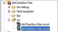
Folder Structure
<?xml version="1.0" encoding="utf-8"?>
<s:Application
xmlns:fx="http://ns.adobe.com/mxml/2009"
xmlns:s="library://ns.adobe.com/flex/spark"
xmlns:mx="library://ns.adobe.com/flex/halo"
minWidth="1020"
minHeight="720"
frameRate="99"
backgroundColor="0xe0f0ff" viewSourceURL="srcview/index.html">
<fx:Style>
@namespace mx "library://ns.adobe.com/flex/halo";
@namespace s "library://ns.adobe.com/flex/spark";
s|CheckBox {
skinClass: ClassReference("AHCheckboxSkin");
symbolColorChecked: "0x70d000";
symbolColorUnchecked: "0xe83800";
fontSize: "11";
color: "0x606060";
}
.default {
skinClass: ClassReference("spark.skins.spark.CheckBoxSkin");
}
</fx:Style>
<s:HGroup gap="25" horizontalCenter="0" verticalCenter="0">
<s:VGroup gap="5">
<s:Label text="Default Spark CheckBox" paddingBottom="4" fontSize="11" textDecoration="underline" />
<s:CheckBox label="Show Goalkeepers" styleName="default" selected="true" />
<s:CheckBox label="Show Defenders" styleName="default" />
<s:CheckBox label="Show Midfielders" styleName="default" selected="true"/>
<s:CheckBox label="Show Attackers" styleName="default" selected="true"/>
<s:CheckBox label="Show Coaches" styleName="default" />
</s:VGroup>
<s:Line height="100%" >
<s:stroke>
<s:SolidColorStroke weight="1" color="0xd0e0f0" />
</s:stroke>
</s:Line>
<s:VGroup gap="5">
<s:Label text="Custom Spark CheckBox" paddingBottom="4" fontSize="11" textDecoration="underline" />
<s:CheckBox label="Show Goalkeepers" selected="true" />
<s:CheckBox label="Show Defenders" selected="true"/>
<s:CheckBox label="Show Midfielder" />
<s:CheckBox label="Show Attackers" />
<s:CheckBox label="Show Coaches" selected="true"/>
</s:VGroup>
</s:HGroup>
</s:Application>
Skin class (say AHCheckboxSkin.mxml )
<?xml version="1.0" encoding="utf-8"?>
<s:SparkSkin xmlns:fx="http://ns.adobe.com/mxml/2009" xmlns:s="library://ns.adobe.com/flex/spark"
alpha.disabledStates="0.5" creationComplete="sparkskin1_creationCompleteHandler(event)">
<fx:Metadata>
<![CDATA[
/**
* @copy spark.skins.default.ApplicationSkin#hostComponent
*/
[HostComponent("spark.components.CheckBox")]
]]>
</fx:Metadata>
<fx:Script>
<![CDATA[
import mx.utils.ColorUtil;
import mx.events.FlexEvent;
[Bindable]
private var highlightColor:uint;
protected function sparkskin1_creationCompleteHandler(event:FlexEvent):void
{
hostComponent.buttonMode = true;
hostComponent.useHandCursor = true;
var col:uint = uint (hostComponent.getStyle('color'));
highlightColor = ColorUtil.adjustBrightness(col, 80);
}
]]>
</fx:Script>
<fx:Declarations>
<s:Linear id="easer" easeInFraction="0.5" easeOutFraction="0.5" />
</fx:Declarations>
<s:states>
<s:State name="up" stateGroups="unchecked" />
<s:State name="over" stateGroups="overStates, unchecked" />
<s:State name="down" stateGroups="downStates, unchecked" />
<s:State name="disabled" stateGroups="disabledStates, unchecked" />
<s:State name="upAndSelected" stateGroups="selectedStates, checked" />
<s:State name="overAndSelected" stateGroups="overStates, selectedStates, checked" />
<s:State name="downAndSelected" stateGroups="downStates, selectedStates, checked" />
<s:State name="disabledAndSelected" stateGroups="disabledStates, selectedStates, checked" />
</s:states>
<!-- Transitions for the mark -->
<s:transitions>
<s:Transition fromState="unchecked" toState="overAndSelected" >
<s:Parallel target="{checkedMark}" >
<s:Scale duration="250" scaleXBy="1" easer="{easer}" />
</s:Parallel>
</s:Transition>
<s:Transition fromState="checked" toState="over" >
<s:Parallel target="{uncheckedMark}">
<s:Scale duration="250" easer="{easer}" />
</s:Parallel>
</s:Transition>
</s:transitions>
<!-- Label -->
<s:Label id="labelDisplay"
textAlign="start"
color.over="{highlightColor}"
color.down="{highlightColor}"
color.overAndSelected="{highlightColor}"
color.downAndSelected="{highlightColor}"
verticalAlign="middle"
lineBreak="explicit"
left="16" right="0" top="3" bottom="3" verticalCenter="2" />
<!-- Group with the marks -->
<s:Group id="marks" verticalCenter="0" width="11" height="11" left="0" >
<!-- GraphicElement for the checked-mark -->
<s:Path horizontalCenter="0" verticalCenter="0" width="11" height="11" winding="nonZero" data="M 100 0 C 75.148 24.853 46.191 87.574 46.191 87.574 C 46.191 87.574 14.204 40.716 0 40.716 L 25.11 41.012 L 43.787 62.213 L 79.29 0 L 100 0 Z"
id="checkedMark" scaleX.unchecked="0" scaleX="1" scaleY.unchecked="0" scaleY="1">
<s:fill>
<s:SolidColor color="{hostComponent.getStyle('symbolColorChecked')}"/>
</s:fill>
</s:Path>
<!-- GraphicElement for the unchecked-mark -->
<s:Path horizontalCenter="0" verticalCenter="0" width="9" height="9" winding="nonZero" data="M 100 90.29 L 60.694 42.28 C 72.2 26.205 84.896 9.838 95.214 0 L 74.28 0.1 L 51.336 30.851 L 26.922 1.031 L 0 1.031 C 13.126 7.917 29.115 24.561 43.297 41.625 L 7.425 89.702 L 28.995 89.617 C 28.995 89.617 39.309 73.04 52.832 53.468 C 68.081 72.987 79.403 90.131 79.403 90.131 L 100 90.29 Z"
id="uncheckedMark" scaleX.checked="0" scaleX="1" scaleY.checked="0" scaleY="1">
<s:fill>
<s:SolidColor id="checkMarkFill" color="{hostComponent.getStyle('symbolColorUnchecked')}"/>
</s:fill>
</s:Path>
<!-- Fake HitArea. TODO: Sort out how to use hitArea property, which does not seem to work correctly yet, but haven't investigated -->
<s:Group width="100%" height="100%" alpha="0" >
<s:Rect width="100%" height="100%" >
<s:fill>
<s:SolidColor color="0xff0000" />
</s:fill>
</s:Rect>
</s:Group>
<s:filters>
<s:DropShadowFilter distance="1" strength="0.75" blurX="1" blurY="1" />
</s:filters>
</s:Group>
</s:SparkSkin>
Folder Structure
